The Minimalist Theme runs from 5th May to 26th May 2016
Theme Definition
Traditionally, a minimalistic photo has very few elements in it. It’s simple and clean. It means few, the least, as little as possible. Compositional elements must be kept to a minimum, and the ones that are left should be essential for conveying the overall idea or scene.”Keep it simple” doesn’t mean “keep it boring”. Deciding what to leave out of the frame and create a stronger image can be challenging. A clever use of depth of field will isolate your subject from the background by shooting with an aperture as wide (smallest number) as your lens will allow.
Rules for the theme end competition
Some ideas for the Minimalist Theme
A bright colour or contrasting colours make great minimalist subjects.
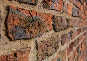
The same applies to textures. Look at the photograph of the brick wall. You can almost feel the texture and roughness of the wall.

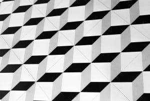
Floor tiles
Photo: Alex McSorley
Sometimes you have to experiment or search for that angle to get that shot that you are happy with. The photograph of the floor tiles is another example of this. The photograph gives you the illusion that it is in 3D or black and white steps. It is in fact floor tiles in a hotel lobby.

Shaded hedge and path
Photo: Alex McSorley
Strong lines make strong images. A good place to get started with minimalist photography is by paying attention to modern architecture around you. Leading lines, and other geometric shapes, can make great backdrops for minimalist pictures.

Bird on wire
Photo: Alex McSorley
Isolating a bird on a power line, if done well, can make a great minimalist shot.
There are great opportunities around you all the time.
Its has been said on some of these web sites that minimalist photography (use of negative space) is in demand as advertisers can insert their logo without affecting the photo. Like the bird on the wire.


